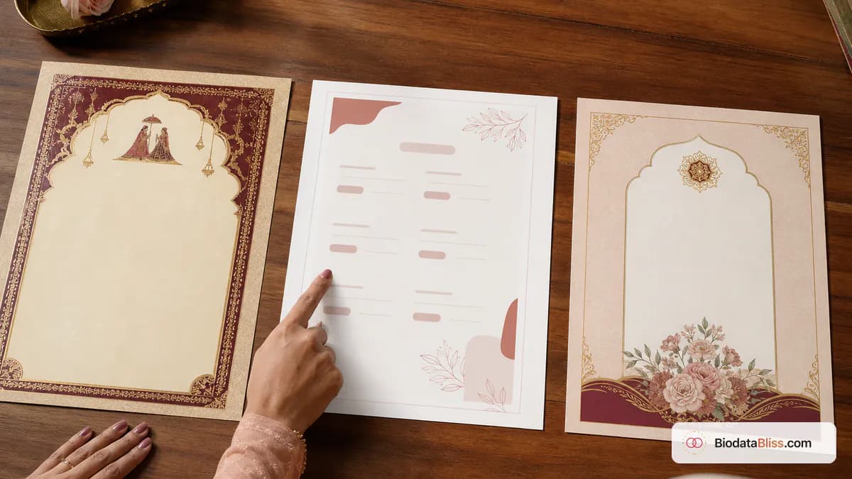
Choosing a template should feel like choosing clothes for an important family meeting: you want it neat, comfortable, and appropriate for the occasion. The best design is the one that makes your details easy to trust.
People often spend more time choosing colours than checking whether their biodata is easy to read. That is a costly mistake. When preparing a marriage biodata PDF, clarity wins before creativity. A great marriage biodata template supports your content: it highlights important facts, keeps sections scannable on mobile, and still looks dignified in print. This guide helps you choose quickly and confidently, based on audience and sharing method—not guesswork.
What a Biodata Template Changes (and What It Doesn't)
A template changes layout, typography, spacing, section hierarchy, and visual tone. It does not change your core data. Your personal, family, education, and contact details remain the same.
That is why real preview matters. Placeholder text can look perfect in thumbnails, but your actual content might wrap poorly or feel crowded in the final PDF.
- Heading font and contrast affect readability for elders
- Section spacing controls how quickly families scan details
- Photo placement changes first impression
- Border style sets tone: minimal, modern, or ceremonial
- Long family/education lines reveal whether layout is practical
- Preview watermark is screen-only, not in paid output
When to Pick a Simple Template
Simple templates are ideal when you want maximum clarity with minimum distraction. They work especially well when biodatas are forwarded repeatedly on WhatsApp groups.
If your biodata has many lines (higher studies, siblings, relocation notes), simple layouts prevent visual fatigue and keep the document readable at a glance.
- Best for mobile-first reading
- Great for professional and text-heavy profiles
- Works well with neutral, modest photos
- Easy to print at home without losing sharpness
- Safe choice when families prefer straightforward presentation
- Reduces risk of decorative clutter hiding key details
When Modern Templates Work Better
Modern designs add personality without becoming flashy. They usually combine clean fonts with subtle color accents and structured spacing.
Use them when both families value polished presentation and digital readability, but still expect traditional biodata sections like family details and partner preferences.
- Balanced look for urban and professional family sharing
- Good for email and PDF sharing beyond WhatsApp
- Maintains formal tone without heavy ornamentation
- Works for candidates who want contemporary style respectfully
- Handles moderate content well when spacing is balanced
- Easy to customize with font and color tweaks
When Traditional or Premium Design Is the Better Fit
Traditional and premium templates are often preferred in formal family-led introductions, meeting-based exchanges, or communities that expect ceremonial presentation.
These styles can look beautiful in print, but they need careful checking to ensure fonts remain legible and decorative elements do not overpower core details.
- Fits classic family marriage biodata presentation style
- Useful for in-person meetings and printed biodata exchange
- Can feel more familiar to elders in ritual-focused circles
- Looks strongest with clean portrait and concise section text
- Print quality matters more when borders are detailed
- Best when tone required is formal and heritage-oriented
Premium style should support readability, not replace it. If a decorative design hides details, choose a cleaner option.
A 5-Minute Decision Method on BiodataBliss
Use this practical process: fill your details once, open preview, and compare templates using your real text. Start broad, then narrow quickly based on readability and tone.
Do not go to payment until one design passes both tests: (1) easy to read on phone and (2) acceptable for elders in print.
- Step 1: Fill Basics, Family, Contact, Photo completely
- Step 2: Open preview and shortlist 3 templates
- Step 3: Read longest section in each on mobile
- Step 4: Check with and without photo if relevant
- Step 5: Ask one elder and one peer for quick feedback
- Step 6: Finalize and pay only after this comparison pass
Choose Based on Sharing Channel: WhatsApp vs Print
Channel decides design. If most sharing happens on WhatsApp, prioritize contrast, font size, and clean section blocks. If primary use is printed handover, you can choose denser or more formal layouts.
In mixed use, pick the template that remains clear on mobile first, then verify print preview. A design that fails on phone loses opportunities early.
- WhatsApp-first: simple/modern with clear typography
- Print-first: traditional/premium with tested margins
- Email sharing: modern or simple for cleaner digital impression
- Family coordinator handover: include concise contact and preference section
- Avoid over-stylized fonts that reduce readability
- Re-download paid PDF later from success page when needed
Final tip
The right marriage biodata template is the one families can understand quickly and respectfully. Let readability lead your choice, then style. Once your design is finalized, review your content quality too—especially common mistakes and checklist essentials—so your final BiodataBliss PDF is both attractive and trustworthy.
Browse all designs on https://biodatabliss.com/templates (opens in a new tab) and see per-template pricing on https://biodatabliss.com/pricing (opens in a new tab) before you checkout.
Already filled your details? Open preview, compare templates with your real text, and download when one design feels right.
Browse templates